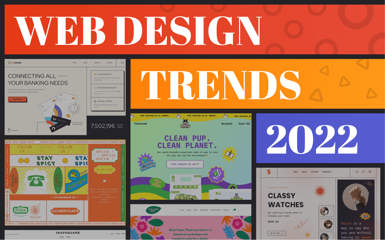
Top 5 Web Design Trends of 2023 That Will Elevate Your Site
As we venture deeper into 2023, it’s essential to stay updated with the latest web design trends that can significantly enhance user experience and engagement. Here are the Top 5 Web Design Trends of 2023 that are reshaping how websites are created and experienced:
- Minimalist Design: Simplicity remains key. A clean layout with plenty of white space emphasizes essential content while allowing users to focus on what truly matters. This design style not only looks modern but also improves load times and mobile usability. For inspiration, check out Smashing Magazine.
- Dark Mode: With more users opting for dark interfaces to reduce eye strain, it’s crucial to consider this option. Dark mode not only offers a sleek aesthetic but can also extend battery life on mobile devices. An excellent resource on this trend can be found at UX Design.
- Micro-Interactions: These small animations or design elements enhance the user experience by providing feedback or guiding users through tasks. Whether it’s a subtle animation when hovering over a button or a loading animation, these interactions make the user experience feel more engaging. For more on micro-interactions, visit Creative Bloq.
- Bold Typography: Using large, eye-catching fonts helps convey your message effectively and adds personality to your website. This trend conveys confidence and helps users focus on critical content. Learn more about the impact of typography at Tubik Studio.
- Sustainable Design: As awareness of environmental issues grows, many designers are adopting eco-friendly practices in their work. This trend focuses on creating sites that are not only beautiful but also sustainable, using resources smartly and focusing on energy-efficient methods. Find out more about sustainable design at Webdesigner Depot.
How to Incorporate Bold Typography in Your Web Design
Bold typography can dramatically affect the aesthetics and readability of your web design. To start incorporating it effectively, consider the hierarchy of your text. Use larger, bolder fonts for headings to capture user attention. This can be done by selecting font pairings that complement each other while ensuring that your headers stand out. For instance, pairing a bold sans-serif font with a lighter serif font can create a dynamic contrast that engages the reader. Remember to maintain visual consistency throughout the site to reinforce the overall theme and improve user experience.
Another effective way to utilize bold typography is by emphasizing key phrases within your body text. This technique is particularly useful for landing pages or call-to-action sections. You can use CSS properties like font-weight and text-transform to create visually striking text elements. Additionally, consider using bold typography for buttons and links; it commands attention and encourages visitors to click. For more on the importance of typography in web design, refer to this guide on typography that explores various strategies and trends in depth.
Are Minimalist Designs Really More Effective?
Minimalist designs have surged in popularity, particularly in the digital realm, where the user experience is paramount. The core idea behind minimalism is to strip away unnecessary elements to highlight the essential. According to Smashing Magazine, clean designs enhance usability by allowing users to focus on the content without distraction. This focus can lead to higher conversion rates, as users are more likely to engage with a straightforward and uncluttered interface. Minimalism not only emphasizes aesthetics but also functionality, making designs more effective in several contexts.
However, while minimalist designs can be effective, they are not universally superior for every application. Research suggests that the effectiveness of a design style greatly depends on the audience and the goals of the project. For instance, a Nielsen Norman Group study highlights that overly simplistic designs may frustrate users who seek more information or interaction. The challenge lies in finding a balance that caters to users' needs while maintaining the minimalist philosophy. Thus, whether minimalist designs are more effective ultimately hinges on the specific context in which they are employed.