2Mami Insights
Your go-to source for news, tips, and inspiration.
Mistakes That Make Your UI a User's Worst Nightmare
Uncover the shocking UI blunders that repel users! Avoid these mistakes to transform your design into a dream come true.
Top 10 UI Mistakes That Drive Users Crazy
User interface (UI) design is crucial for creating a seamless experience, but even the best-intentioned designers can overlook essential elements. One of the most glaring UI mistakes occurs when interfaces are cluttered with excessive information and options, overwhelming users instead of guiding them. Proper organization and the use of whitespace are key to a clean UI. Additionally, using indiscernible icons or unclear labels can confuse users—consider leveraging descriptive text alongside icons for enhanced clarity.
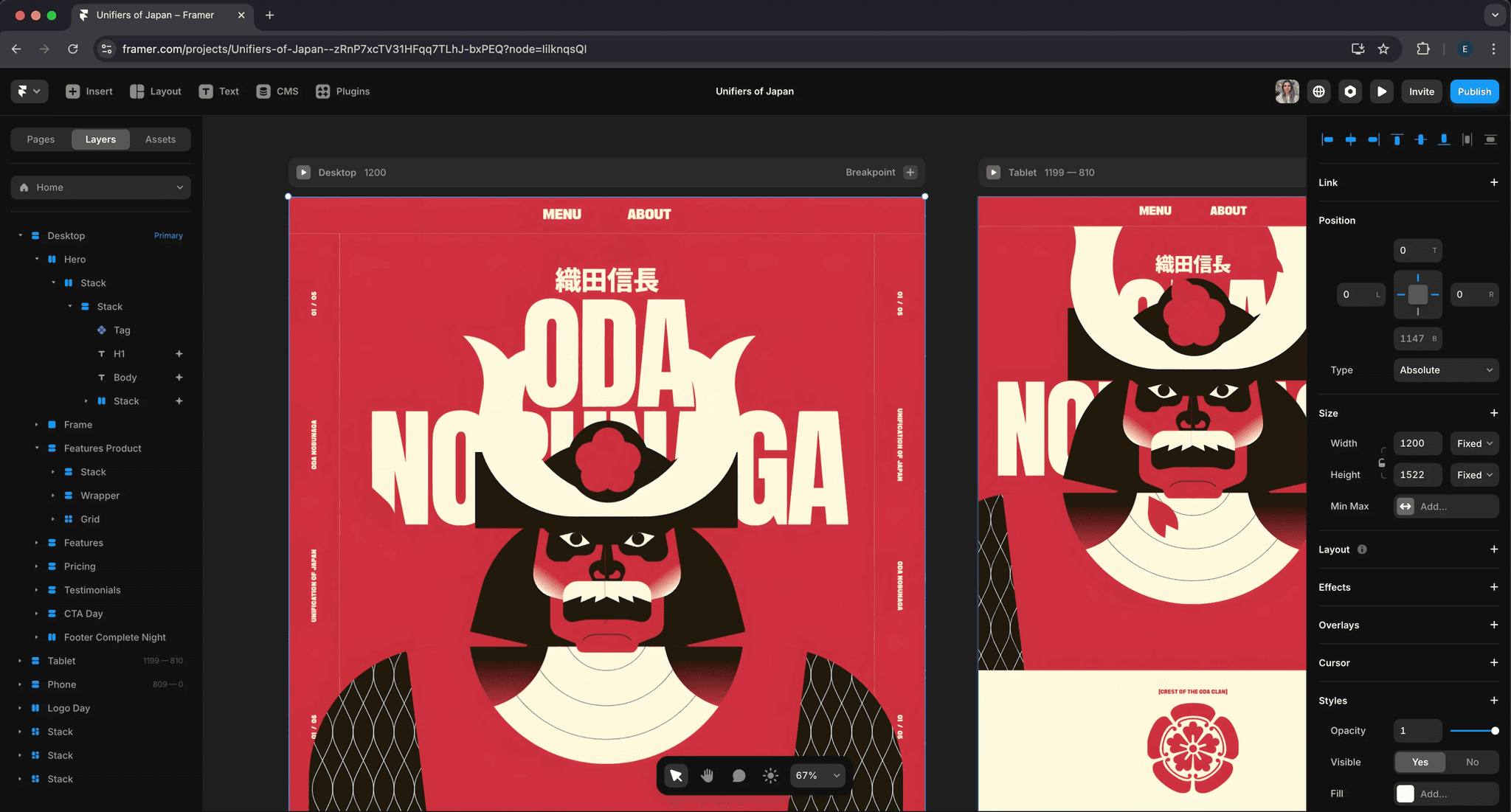
Another major UI mistake that drives users crazy is the lack of responsiveness. In today's mobile era, a website or application needs to adapt seamlessly to various devices. A non-responsive design can lead to frustrating experiences, particularly when text becomes unreadable or essential buttons are inaccessible. Users often abandon sites that require excessive zooming or pinching, further emphasizing the importance of responsive UI. For best practices, take a look at responsive design guidelines that ensure your UI remains user-friendly across all devices.

Are You Making These Common UI Design Flaws?
UI design plays a crucial role in enhancing user experience, yet many designers fall into the trap of common UI design flaws. One major mistake is the lack of consistency in design elements. When buttons, colors, and fonts vary across a website or application, users may feel confused, leading to frustration and abandonment. To avoid this, adhere to established design systems and guidelines, ensuring that all components work harmoniously. For more insights on maintaining design consistency, check out Smashing Magazine.
Another frequent pitfall is overcrowding the user interface with excessive information and options. This UI design flaw can overwhelm users, making it difficult for them to navigate or identify key actions. A focused approach, utilizing white space effectively, can dramatically improve usability. By prioritizing content and simplifying choices, you encourage users to engage more fully with your site. For tips on decluttering UI, visit Nielsen Norman Group.
How to Avoid UI Pitfalls That Frustrate Users
When designing user interfaces, it's imperative to anticipate potential UI pitfalls that can lead to user frustration. One common mistake is neglecting responsiveness. According to Smashing Magazine, a site that doesn't adapt well to various screen sizes can alienate users and reduce engagement. To avoid this, ensure your design employs responsive design principles, utilizing flexible grids and media queries to create a seamless experience across devices. Additionally, conducting regular usability testing can help pinpoint areas that may hinder user interactions, allowing you to refine your UI before it goes live.
Another major UI pitfall is overwhelming users with excessive information or choices. This phenomenon is often described as cognitive overload, where the user is presented with too many options, leading to confusion and frustration. To mitigate this, prioritize simplicity in your design. Use clear navigation menus and categorize elements logically, as highlighted by Nielsen Norman Group. Implementing progressive disclosure can also help, by presenting essential information upfront while allowing users to access more details as needed. By reducing clutter and focusing on key actions, you can create a more intuitive and user-friendly interface.